Action Plan Myself and Georgia are going to concentrate on the production of our group's Magazine Advertisement. We are going to plan the piece; by coming up with ideas and sketches. So ulitmately, we have decided to put as many of our ideas toegther a spossible to create the advertisement that we all want and are happy with.
Then, myself and Carli are going to actually produce the product. I think that it is best that two of us work on this, as we need more than one opinion on what looks good or bad during the production process. This will have a great impact on the end result, hopefully!
We will need to use the program Indesign and possible Photoshop to produce the product. I think that the piecee will look more effective and attractive if we both practice our skills on these programs before we begin the production.
Sketches and Ideas
I have drawn a sketch to represent what I would like the end result to look like. This sketch was based on the ideas of both myself, and Georgia.

Personally, I really like the idea of having two pictures blended together, in a 'overlay' style. I think that it will really suit the genre of 'Mazzy Star', and in particular 'Into Dust'. However, prior to the construction of this product, I must express personal worries about the skills involved in making an effective-looking product. We want to be able to achieve an end result that could be interpreted as an existing media product. In this, we are competing with products that have expertise exercised on them! However, due to the fact that there will be both myself and Carli, I'm sure that we will be able to pull it off.
And, Georgia has also drawn her own sketch, to represent her initial ideas when asked to produce a magazine advertisement.

To me personally, the piece looks a little more suitable for a magazine cover, rather than a magazine advertisement. From this, I can learn that this may be an issue in our production period and is something that I will have to keep a close eye on, in case our end result doesn't look effective on completion.

 I am very pleased with the final magazine advertisement that we produced. It is somewhat different from how I imagined it would be, but there are some similarities in my vision and the end result.
 2. We then added in our first photograph, using the 'place tool', which then enabled us to be able to edit the size of the photo. Me and Carli felt that it would look good if the photo was approximately half the size of an a4 side, which would be the size of the advertisement in an actual magazine.
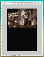 4. After discussing and clarifying what kind of effect we both had in mind for the product that we were constructing, we used the 'layer mask' tool to effectively 'cut' the edges of the photo away so that we were left with the parts that we wanted only. This would enable us to be able to overlay the two photos, only having the parts that we had left of this photo (which would be on top), visible and blended with the original first photo.
 6. After a while spent on playing around with dragging the line used to create this (changing direction and length every time to see which looked and worked best), we finally agreed on a result that we thought looked really good. After consulting the font chart that I made previously and considering the results that I have shown in the form of a tally in a different blog post, we added in the title 'Mazzy Star'. This was a very rough outline of what we wanted the title to look like, as we were yet to decide the size, placing and effects that we put on it, if any.
 8. As it was vitally important that the product looked 'just right', we had to alter the text font, size and placement; and it took a great deal of our time playing around with this as we just couldn't agree!


