
 2. We then added in our first photograph, using the 'place tool', which then enabled us to be able to edit the size of the photo. Me and Carli felt that it would look good if the photo was approximately half the size of an a4 side, which would be the size of the advertisement in an actual magazine.
 3. We then had to create a new layer by clicking on the 'make new layer' icon. We could then add on our second photograph, placing and sizing it accordingly.
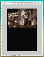 4. After discussing and clarifying what kind of effect we both had in mind for the product that we were constructing, we used the 'layer mask' tool to effectively 'cut' the edges of the photo away so that we were left with the parts that we wanted only. This would enable us to be able to overlay the two photos, only having the parts that we had left of this photo (which would be on top), visible and blended with the original first photo.
 6. After a while spent on playing around with dragging the line used to create this (changing direction and length every time to see which looked and worked best), we finally agreed on a result that we thought looked really good. After consulting the font chart that I made previously and considering the results that I have shown in the form of a tally in a different blog post, we added in the title 'Mazzy Star'. This was a very rough outline of what we wanted the title to look like, as we were yet to decide the size, placing and effects that we put on it, if any.

7. We then began to add on all of the text boxes and text that we required for the mag advert. We tended not to pay too much attention to font and size as we did this.
 8. As it was vitally important that the product looked 'just right', we had to alter the text font, size and placement; and it took a great deal of our time playing around with this as we just couldn't agree!

9. In the screenshot below, you can see the further development/ construction of the product in this way. Also, we tried to add on elements of existing media products that we thought might make our own look more professional. Like, for example, we added on an HMV logo, as we had seen this on an existing product prior to creating our own. We also added on the record label logo to which 'Mazzy Star' are signed; which Georgia had designed beforehand, to add on to the Digipak back cover.
10. The final copy of the Magazine Advertisement.

No comments:
Post a Comment