Tuesday, 16 March 2010

Evaluation Question 1

In what ways does your media product use, develop or challenge forms and conventions of real media products?


Evaluation Question 1 Document

Friday, 12 March 2010

Construction Of Magazine Advertisement

1. We opened a new, blank document in Adobe Photoshop and chose a black background colour.

2. We then added in our first photograph, using the 'place tool', which then enabled us to be able to edit the size of the photo. Me and Carli felt that it would look good if the photo was approximately half the size of an a4 side, which would be the size of the advertisement in an actual magazine.

3. We then had to create a new layer by clicking on the 'make new layer' icon. We could then add on our second photograph, placing and sizing it accordingly.
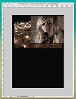
4. After discussing and clarifying what kind of effect we both had in mind for the product that we were constructing, we used the 'layer mask' tool to effectively 'cut' the edges of the photo away so that we were left with the parts that we wanted only. This would enable us to be able to overlay the two photos, only having the parts that we had left of this photo (which would be on top), visible and blended with the original first photo.
We then used the gradient tool, selecting the icon/gradient that is best described as a box fading diagonally from white to black.

5. We then changed the gradient by selecting the 'gradient colour'. We chose to use the 'white into transparent', as, after talking to a member of our media studies and discussing it with him, we decided that this would work best to create the effect that we were looking for.

6. After a while spent on playing around with dragging the line used to create this (changing direction and length every time to see which looked and worked best), we finally agreed on a result that we thought looked really good. After consulting the font chart that I made previously and considering the results that I have shown in the form of a tally in a different blog post, we added in the title 'Mazzy Star'. This was a very rough outline of what we wanted the title to look like, as we were yet to decide the size, placing and effects that we put on it, if any.


7. We then began to add on all of the text boxes and text that we required for the mag advert. We tended not to pay too much attention to font and size as we did this.

8. As it was vitally important that the product looked 'just right', we had to alter the text font, size and placement; and it took a great deal of our time playing around with this as we just couldn't agree!


9. In the screenshot below, you can see the further development/ construction of the product in this way. Also, we tried to add on elements of existing media products that we thought might make our own look more professional. Like, for example, we added on an HMV logo, as we had seen this on an existing product prior to creating our own. We also added on the record label logo to which 'Mazzy Star' are signed; which Georgia had designed beforehand, to add on to the Digipak back cover.


10. The final copy of the Magazine Advertisement.

I think that my group members are very happy with the product that myself and Carli created and I feel particularly proud because I think that it looks very good and could be considered an existing media product of this kind. We have included all of the aspects of an advert that our research has shown us, and have managed (due to a lot of hard work) to create the desired effect. Overall I think that it fits the genre of both 'Mazzy Star' and 'Into Dust' very well.


Thursday, 11 March 2010

Construction Of Digipak

Front cover construction
Georgia was constructing the entire Digipak on her own, on behalf of the group, with our occasional input and direction.
1. Choosing the best and most appropriate photograph
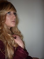
We all liked this photograph and think that it's a really strong picture. It's bold in that it's highly unusual in terms of pose. I also really like the lighting, for example, at the top of the photograph there is a very strong shadow of Charlotte's hand and head on the wall behind her. I think that this makes a really nice effect.


2. Changing the colour, hue and saturation
Nathan, prior to Georgia making her own alterations to the picture, was editing the pictures using effects himself, and from this we were able to all agree that we liked the effect that Nathan had been able to create. And so, this gave Georgia a very good idea of what to do next with the picture, and we were all happy with the end result of the edited photograph.


3. Creating the 'Mazzy Star' band title
Georgia created a 'logo' to put on the front cover that included the essential information and what would typically be found on an existing media product of this kind.
In order to do this, Georgia focused on the brown shades that were caused by the de-saturation effect that she had used on the original photograph. She wanted to use a blurred effect but after doing this, the whole group, and our media studies teacher included, felt that it didn't look right and we all made suggestions to fix this problem.


4. Adjusting the 'Mazzy Star' text
Despite group discussions on how we felt about the text that was used on the Digipak, and the need for it to match that was used on the Magazine Advertisement; we all decided that this text looked best on the Digipak and the text that we had used on the Magazine Advertisement did not not work on this product, and vice versa.
In conclusion, this is the text that we thought worked best on this product.

5. Editing
After the initial idea of using a blurred effect on the hand and then placing the text 'Mazzy Star' over the top, and our decision that this would not work, Georgia then went on to experiment on using just a text box with no blur effect used. This did not look right either, however.


6. The position of the text
It was then essential to play around with the position of the two text boxes. It was a very challenging task making the decision of where to place the text boxes on the area, because it need to look 'just right'! Georgia, with direction from the rest of the group, managed to get the placing right eventually, although we all agreed that there was still something missing. Nathan added the light in the corner of the product, a 'lens flare', as we thought that it would look really good here. First of all, we thought that it should be placed on Charlotte's hand somewhere, but it did not work here.


7. 'Stardust'
Our media studies teacher suggested that we add something 'twinkly' and stardust-like to the product as it would fit and work really well, as the title says 'Into Dust'. Below is our final product.


Inside construction

Georgia, after getting the idea from our media studies teacher, took a photograph of a cream sheet, with the 'ruffled' effect. This made the crinkles in the sheet stand out, adding an extra effect to the photograph.

She added three of the photographs that we had used and obtained throughout the journey of our project, and placed them on top of the sheet, overlaying them, and blurring them into the background. We thought that it was important to use photographs that related to other aspects of the project, i.e the main video and magazine advertisement, in order for the audience to be able to associate them with one another and to make the chain of products easily recognisable. It took Georgia quite a few tries to get the positioning, size and blurring just right but in the end I think that she made it look really good!

A copy of our final inside cover for the digipak.


Back cover construction

1. The original photograph.
We decided that this photo would work really well as a back cover photo mainly because of the large amount of space on the right-hand side, which allows adequate room for the track listing.
I don't particularly like this photo very much as I think that it is dull, but the rest of my group seemed keen to use it, so I thought it best we follow 'majority rules' in this case, as it couldn't be that bad if they all liked it!


2. Georgia edited the contrast and saturation of the photoshop, in order to maintain the consistence of this throughout the Digipak (she wanted it to fit with the tone of the photo on the front cover).
She also cropped the original photo in order to fit the size requirements in making it a square shape. The original image was let down by the mistake of including the radiator underneath Charlotte's hand- this would not be found on existing media products unless on purpose, which I don't think would be a very good or interesting photo anyway!

3. By adding a radial lighting effect to the background space of the image, Georgia was able to make the image darker around the images - linking it with more effectively with the photo on the front cover of the Digipak.

4. It is important to include the addition of typical Digipak elements such as barcode, record label etc.- and these were elements that Georgia also had to consider, create and include, resultedly. She also included the additon of the 'small print', as she referred to it.


5. Georgia used right-alignment for the text of the track listing, as she felt that this was very different to other existing media products of this kind that she had seen in her research. She used a type of text wrap around the light of the background that she had added in previously, and this helped to shape the light and Charlotte's face. I think that this works really well. For the list of tracks in the text back, Georgia used the tracks for the album that the song 'Into Dust' actually belongs, as she felt that there was some significance in this, and that it would make most sense.


6. Georgia added some final touches, and finished the Digipak back cover. I think that it does look really good, and despite all criticism that I had for the original photograph, I do think that it looks really good and I am very pleased with the end result. Well done Georgia!


Tuesday, 9 March 2010

Re-Taking Pictures For The Digipak - Monday 8th March

Nathan and I spent a few hours taking pictures of both Nathan and Charlotte to use in the Digipak. This time, as it was our second time trying to produce photographs adequate to be included in our Digipak, we had to take the shots very carefully, and despite only wanting to spend a very short time completing this section of the production, we ended up spending quite a large amount of time preparing and photographing Charlotte. We dressed Charlotte in a floral playsuit and the maroon colour blazer that she was wearing throughout the part of filming that we produced in the barn. This was to demonstrate that we had chosen very carefully to create the effect of continuity in creating our music video and ancillary tasks.

We used the sketches that Carli had published on her blog previously, to give us incite into what exactly we wanted the photographs to look like in terms of angle, placing and Charlotte's expression or movement etc. We decided on what strength of light we should use, as it was available to us in Charlotte's house at the time, as we could not predict prior to the photoshoot how exactly the photos would look. Myself and Nathan made an executive decision to use a cream background to stand Charlotte against whilst photographing her, as we did at Nathan's house, when we took the first set of photographs, as we decided this would later enable us to choose different photographs from both days of filming, as they would be similar in this way.
We only took a small number of photographs, as we decided that the ones that we did manage to capture were good enough on their own, but we did take a couple of extras to ensure that we did not need to return to take more photographs at a later date. I have chosen to publish the ones that I think look best.

Sketch 1.


The photographs taken.


Sketch 2.


The photographs taken.


Sketch 3.


The photographs taken.

Sketch 4.

Friday, 5 March 2010

Sketches Of Ideas For The Digipak Front Cover

To give the group a rough idea of what we wanted our digipak to look like, Carli produced some rough sketches of designs that she had been inspired by from a wide range of existing media and also other CD or Digipak cover designs, that she found on the internet.
However good the sketches are, unfortunately she managed to mis-spell the title of the song, naming it 'Into The Dust', instead of it's actual name; which is, 'Into Dust'.
So, in order to fix this problem I used Carli's sketches as a rough guideline, as the whole group really liked the ideas and outlines, and created my own, instead.

Idea 1
Idea 2 Idea 3
Idea 4

My Thoughts:

I really like the sketches and think they are very appropriately laid-out. I think that there are some very good ideas and will give us a good base for the creation of our Digipak.

Sketch 1. would be used as the front cover for the digipak, as it is really bold and strong. I really like this idea and think the whole group agrees on the image that it both uses and creates. In editing for its actual use, there are a large number of editing possibilities and effects that we could use on the original photograph that would look really good in the final product.

Sketch 2. is a necessity as 'Mazzy Star' is a band, and so consists of more than just a singer. It would be expected in any existing media product of this kind, that a picture of the whole group would be included, despite the main attraction to listening to the music being the singer. I think that our Digipak would be made more effective by the inclusion of the picture of the two members of the band.

Sketch 3. would be used as an extra photo of the singer inside the Digipak. I do not, personally, like this sketch idea, as it seems to be a bit bland or plain, as there is nothing very exciting going on in the photo.

Sketch 4. would most likely be used inside the Digipak. I really like the angle at which the sketch demonstrates how the singer would be facing etc. However, on taking the photograph that is our own version of this sketch, myself and Nathan decided that it would be more effective if Charlotte was laying down looking straight up towards the camera; with her hair spread out beside her.

Thursday, 4 March 2010

Planning For The Digipak

Action Plan
For this task, we aree all going to put our own ideas forward and contribute to the planning of the appearance of the product.
Georgia is going to actually produce the whole of the Digipak on her own, a challenge she seemed happy to set herself, but we will offer her advice, guidance and help where appropriate.
Although Georgia will have to put a very large amount of work, time and effort into the production of this particular media product, as part of the ancillary task for our overall project, we will all have a contribution by offering our own opinions, as we all want to be able to appreciate the appearance of the end result.

Ellie Goulding - Existing Album Cover
I researched on the internet to find this existing media product. I find this cover particularly attractive as it has lots of lights on it, in relation to the title of the album. To me, this makes the idea very clever, as it is mixing up the different products of this artist. I think that this continuity/ relation is very clever. The photograph used is very appealing, as the artist would be considered by most as being very attractive.
The artist is spread across almost the whole of the space given. This makes her dominant and shows her as being the main attraction. Ellie Goulding's existing fans would recognise this as being her album cover as they would recognise the large photo of her on the front. The photograph on the front cover seems to me to be almost like a statement, and it works very well.

Wednesday, 3 March 2010

Planning For The Magazine Advertisement

Action Plan
Myself and Georgia are going to concentrate on the production of our group's Magazine Advertisement. We are going to plan the piece; by coming up with ideas and sketches. So ulitmately, we have decided to put as many of our ideas toegther a spossible to create the advertisement that we all want and are happy with.
Then, myself and Carli are going to actually produce the product. I think that it is best that two of us work on this, as we need more than one opinion on what looks good or bad during the production process. This will have a great impact on the end result, hopefully!
We will need to use the program Indesign and possible Photoshop to produce the product. I think that the piecee will look more effective and attractive if we both practice our skills on these programs before we begin the production.
Sketches and Ideas
I have drawn a sketch to represent what I would like the end result to look like. This sketch was based on the ideas of both myself, and Georgia.
Personally, I really like the idea of having two pictures blended together, in a 'overlay' style. I think that it will really suit the genre of 'Mazzy Star', and in particular 'Into Dust'. However, prior to the construction of this product, I must express personal worries about the skills involved in making an effective-looking product. We want to be able to achieve an end result that could be interpreted as an existing media product. In this, we are competing with products that have expertise exercised on them! However, due to the fact that there will be both myself and Carli, I'm sure that we will be able to pull it off.
And, Georgia has also drawn her own sketch, to represent her initial ideas when asked to produce a magazine advertisement.


To me personally, the piece looks a little more suitable for a magazine cover, rather than a magazine advertisement. From this, I can learn that this may be an issue in our production period and is something that I will have to keep a close eye on, in case our end result doesn't look effective on completion.