Why do I need to get feedback?It is important that we gain feedback on the rough copies of our completed tasks as there may be certain things that we have done that are particularly good, or work particularly well, and so it would be a mistake if we changed these features at a later date. If we know the particular features that work well on the completed work, then we can refrain from changing them in this way. Also, it is vital that the group receives contructive criticism on their work, as there may be something that does not work at all, and needs to be changed; in case it would lead to a loss of marks for the group. Constructive criticism is the way that the group can gain outside influences on the project, as sometimes it is easier to spot a mistake 'further away from the computer screen', as it is sometimes easier to spot a mistake if you are the one completing the task or project.
Feedback for the main taskI prepared a questionnaire for my group to conduct, using our rough cut version of the video for people to analyse, comment about and answer questions on the subject of.
I tried to include questions that would be helpful to my group. Basically, it was information that Nathan would need to know for the editing/composition of the music video in order to correct it or change it in some way, as he was mainly responsible for the editing of the music video.
The questions that I included were as follows; - How do you feel about the very beginning of the music video and the way in which it starts? Is this effective?
- What immediately strikes you about the music video as being particularly good?
- What immediately strikes you as being particularly bad or wrong?
- Do you have any ideas for changes that you think should be made to the music video in order to improve it?
- How do you feel about the shot changes in terms of speed, continuity, effects used etc?
- How do you feel about the mixture of two very different scenes or locations being used throughout the music video?
- How do you feel about the shots that we have used in terms of length, camera angle, and mise-en-scene etc?
- How do you feel about the way that the music video ends? Is this effective?
As Nathan completed most of the editing of the main task, the music video, he took on the responsibility of having to gat the audience feedback for the rough cut of the product. He gained both praise and constructive criticism for the work that he had done, from six different sources.
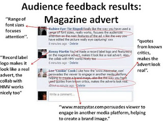
Louise Barwell:"I like the overlay with the two different images. The five stars and the opinion from Q magazine make it look like it belongs in a magazine. I also like how the important information like the artist name, album name and the release date are in bigger fonts so they stand out. The HMV logo at the bottom also makes it look more realistic. It looks good, well done! :) "
Joe Foley:" Its good. I like the look to it and the use of record logos such as HMV and quotes from MTV and Q makes it look like a real media magazine advert. If i wouldn't have known you lot made it, i would have thought it was a real advert".
Fahmina Ali:"I like how the main singer has been pasted into the background of a scene from the video so it actually links with the main product. And i also love the font and colour of the text which goes well with the lights in the picture aswell".
Adam Johnson:"Complete disgrace to my eyes. I want that small few seconds of my life back please. Just kidding :D I like the overlay effects and the position of the text. It doesn't look to busy and packed with texts like some adverts do."
Michael Burrin:"I like the fade between the two images. it helps create a dreamlike state that is similar to what the music video accomplishes. use of industrial logo's helped the aspect of realism also, however i feel that the ground shot could have had a few more fairy lights but otherwise its great".
Jordan Saville:" I like the use of overlay on the two images, i feel it creates a mysterious feel like your music video. I also like the desaturation and slight golden hue placed upon the images which creates a n angelic feel that also works well with your video. However, the choice of text could be more thematical as it doesn't seem as elegant and mysterious as the portrayal of the video and original images.
Feedback for the ancillary tasks
The Digipak Front Cover
As Georgia had created the Digipak almost entirely by herself, she also took responsibility for gaining audience praise and constructive criticism, called 'feedback' for her work.
'Michael Burrin, a Class member commented how he "liked the dust around the word dust". He also said the title should be a bit bigger. And finally that he "likes the light behind her head", following on from this he said about adding a subtle lens flare on the picture.
Andy and Sam also gave feedback on our digipak, commenting on the fact we should "do something with the hand". Sam suggested looking for a tutorial on how to make the text look like it fitted on the hand, but as we had previously tried this we accepted it would not work without re-shooting the photo.
Media teacher: who's highly critical opinion is key to our product. She was happy with the new finished product, and when I asked her about adding something more to the hand she disagreed and did not think this necessary as it would overcrowd the cover, and look "tacky". '
The Magazine Advertisement