Sunday, 28 February 2010

Font Ideas

I constructed a few posters of different fonts that my group could use for the Magazine Advertisement and Digipak. I used 'www.dafont.com' and, also the fonts that were already installed on Photoshop and Word, I scrolled through, searching for fonts that i thought would fit the particular genre of the song that we are using.
I tried to include fonts that could be used for either of the Ancillary tasks, or for just one, so that there was a wide variety of different
fonts. I created the posters by sticking a copy of the font in the words 'Mazzy Star' to give the group an actual idea of what it would look like on the actual product, as I thought that this would help the group greatly on making the decision. I wrote what the font name was underneath the font and also what i thought it would be best suited for.
Using the posters that I had created, my group then asked people, at random, both in and out of our Media Studies class, which of the fonts they thought would best suit firstly the Digipak, and then secondly, the magazine advertisement. We cast 26 votes in total, for each of the ancillary tasks. We did this in order to gain as much audience feedback as possible; in order to create ancillary tasks bes
t suited for their purpose.


How do I feel about the fonts that I have collected, and will this help my group?

I tried to include close-up photographs of the fonts that i thought were most interesting or stood out from the others. I hope that my group will consider my findings when, during the production of the Magazine Advertisement and Digipak, a font will need to be chosen.

Results

Saturday, 27 February 2010

Feedback

Why do I need to get feedback?
It is important that we gain feedback on the rough copies of our completed tasks as there may be certain things that we have done that are particularly good, or work particularly well, and so it would be a mistake if we changed these features at a later date. If we know the particular features that work well on the completed work, then we can refrain from changing them in this way. Also, it is vital that the group receives contructive criticism on their work, as there may be something that does not work at all, and needs to be changed; in case it would lead to a loss of marks for the group. Constructive criticism is the way that the group can gain outside influences on the project, as sometimes it is easier to spot a mistake 'further away from the computer screen', as it is sometimes easier to spot a mistake if you are the one completing the task or project.

Feedback for the main task

I prepared a questionnaire for my group to conduct, using our rough cut version of the video for people to analyse, comment about and answer questions on the subject of.
I tried to include questions that would be helpful to my group. Basically, it was information that Nathan would need to know for the editing/composition of the music video in order to correct it or change it in some way, as he was mainly responsible for the editing of the music video.
The questions that I included were as follows;

  • How do you feel about the very beginning of the music video and the way in which it starts? Is this effective?

  • What immediately strikes you about the music video as being particularly good?

  • What immediately strikes you as being particularly bad or wrong?

  • Do you have any ideas for changes that you think should be made to the music video in order to improve it?

  • How do you feel about the shot changes in terms of speed, continuity, effects used etc?

  • How do you feel about the mixture of two very different scenes or locations being used throughout the music video?

  • How do you feel about the shots that we have used in terms of length, camera angle, and mise-en-scene etc?

  • How do you feel about the way that the music video ends? Is this effective?

As Nathan completed most of the editing of the main task, the music video, he took on the responsibility of having to gat the audience feedback for the rough cut of the product. He gained both praise and constructive criticism for the work that he had done, from six different sources.

Louise Barwell:"I like the overlay with the two different images. The five stars and the opinion from Q magazine make it look like it belongs in a magazine. I also like how the important information like the artist name, album name and the release date are in bigger fonts so they stand out. The HMV logo at the bottom also makes it look more realistic. It looks good, well done! :) "

Joe Foley:" Its good. I like the look to it and the use of record logos such as HMV and quotes from MTV and Q makes it look like a real media magazine advert. If i wouldn't have known you lot made it, i would have thought it was a real advert".

Fahmina Ali:"I like how the main singer has been pasted into the background of a scene from the video so it actually links with the main product. And i also love the font and colour of the text which goes well with the lights in the picture aswell".

Adam Johnson:"Complete disgrace to my eyes. I want that small few seconds of my life back please. Just kidding :D I like the overlay effects and the position of the text. It doesn't look to busy and packed with texts like some adverts do."

Michael Burrin:"I like the fade between the two images. it helps create a dreamlike state that is similar to what the music video accomplishes. use of industrial logo's helped the aspect of realism also, however i feel that the ground shot could have had a few more fairy lights but otherwise its great".

Jordan Saville:" I like the use of overlay on the two images, i feel it creates a mysterious feel like your music video. I also like the desaturation and slight golden hue placed upon the images which creates a n angelic feel that also works well with your video. However, the choice of text could be more thematical as it doesn't seem as elegant and mysterious as the portrayal of the video and original images.

Feedback for the ancillary tasks


The Digipak Front Cover

As Georgia had created the Digipak almost entirely by herself, she also took responsibility for gaining audience praise and constructive criticism, called 'feedback' for her work.

'Michael Burrin, a Class member commented how he "liked the dust around the word dust". He also said the title should be a bit bigger. And finally that he "likes the light behind her head", following on from this he said about adding a subtle lens flare on the picture.
Andy and Sam also gave feedback on our digipak, commenting on the fact we should "do something with the hand". Sam suggested looking for a tutorial on how to make the text look like it fitted on the hand, but as we had previously tried this we accepted it would not work without re-shooting the photo.
Media teacher: who's highly critical opinion is key to our product. She was happy with the new finished product, and when I asked her about adding something more to the hand she disagreed and did not think this necessary as it would overcrowd the cover, and look "tacky". '

The Magazine Advertisement
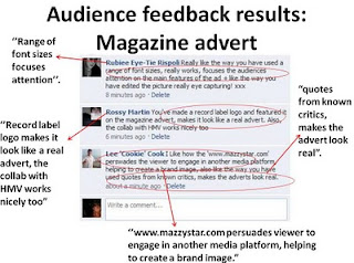
Friday, 26 February 2010

Thursday, 25 February 2010

Second Part Of Re-Filming Analysis - Wednesday 24th February

Me, Georgia and Nathan went back to the woods in New Ash Green to re-film the part of the music video located there. This was necessary as we had changed our minds about quite a large number of the shots we had previously taken, and also had added new ideas of shots to the list, and we needed to shoot those.
Before filming, myself and Georgia had to buy balloons and ribbon and blow them up so that we could start filming as soon as we got there, preventing us from wasting time in the freezing cold weather; as Charlotte kept getting ill from being stupidly dressed in the winter!
It was significantly easier this time, than the first, as we had a rough idea of what we wanted the place to look like already; enabling to set it up for shooting much more easily. We also, having learned from the first time filming at this location, that the process was made much easier by making a list of the shots that we wanted and needed to take. This way, we saved time as we could keep referring back to the list.
Despite the improvement of organisation, we actually managed to get a little less filming done than the first time we filmed at that location, as it was raining quite heavily. It got so bad that we couldn't carry on filming. Nathan still managed to get a few good shots filmed; and the day was quite productive as Georgia and Nathan worked together to film the shots that they thought would look best.

Tuesday, 23 February 2010

First Part Of Re-Filming Analysis - Monday 22nd February

As, in the original filming, it was too dark and we did not light the area we were filming in, adequately. We had to re-film the shots to make sure the footage looks professional. Myself, Nathan and Charlotte spent a further few hours re-filming and made sure that there were more lights shining on the part of the barn that we were using as a stage.
The day was very productive as we taught ourselves exactly how much light was needed facing onto the set, for the rest of the filming that needed to be done at this location. We managed to capture a large amount of footage that is more than suitable for inclusion in the final piece that we will be producing.

Wednesday, 17 February 2010

Taking The Photographs For The Digipak And Magazine Advertisement - Tuesday 16th February

On this day, the whole group met, planning to re-film part of our music video, as the original material was inadequate. However, after meeting up, we decided that the weather was against us, as it was raining very heavily, and showing no signs of stopping.
In order to make the most use out of our day we decided to take the opportunity to take the pictures for our Digipak and Magazine Advertisement (the ancillary task) as we were all together and had no other engagements that day.
We re-located to Nathan's house and, although having previously run through the ideas that we had for the pictures, we had a brief discussion checking that we all had the same understanding of what we wanted the pictures to look like.
We made a trip to Hobby Craft to get some gold sequins, gold glitter, and black and white paint.
We then used these in all of the pictures that we took. In the first set of photographs, Nathan and Georgia stuck loads of gold sequins to Charlotte's hands and I then put gold glittery make-up around her eyes, to match, while Carli was shopping on the internet, or something like that. We chose to take the photographs against a plain cream background, in order to avoid the event of a clash of colours in the picture.
Georgia and Charlotte decided on an outfit for the photographs while myself and Nathan chose an appropriate location for the photographing; making sure that there was a cream wall in the background.
For the next set of photographs we removed the sequins and glitter and used normal make-up to take some pictures of Charlotte laying down- at a upside-down angle.
The pictures in which Charlotte is sitting holding a guitar, we included as; in the other pictures there is no reference to singing or music. And as the reason for taking the photographs in the first place is to promote her profession (which is singing), it would be unusual for there to be no reference to this in existing media.
After, Nathan painted her hands; one black, and the other white. We tried to use a variety of different poses to make the photographs look different and unusual. Charlotte was very good at coming up with the movement and poses herself. Referring back to the photographs that we took, I think that we managed this quite well.
I have considered that this is due to the fact that as the whole group was together, there were more ideas flying around, and the end result seems to be very creative.
Me applying the gold glitter to Charlotte's eyes

The glitter and gold sequins being applied

Nathan mid applying the gold sequins to Charlotte's hands for a particular set of photographs

Me, putting the glod glitter around Charlotte's eyes, again

Charlotte spraying her hair to make sure that it stayed wavey and in exactly the same place throughout the photographs

The Photographs For The Digipak And Magazine Advertisement


Monday, 15 February 2010

Magazine Advertisement Research

Advertisement in general
Advertising is a form of communication intended to persuade its viewers, readers or listeners to take some action. It usually includes the name of a product or service and how that product or service could benefit the consumer, to persuade potential customers to purchase or to consume that particular brand. Modern advertising developed with the rise of mass production in the late 19th and early 20th centuries.
Commercial advertisers often seek to generate increased consumption of their products or services through branding which involves the repetition of an image or product name in an effort to associate related qualities with the brand in the minds of consumers. Different types of media can be used to deliver these messages, including traditional media such as newspapers, magazines, television, radio, outdoor or direct mail. Advertising may be placed by an advertising agency on behalf of a company or other organisation.

In summary, what is the specific function of a music magazine advertisement?
A magazine advertisement is making the audience aware of the release of an album or single, or the beginning of a tour of a particular artist.
I have included a list of the things that I have found, through my own research, would or may be included on a magazine advertisement:


  • a/multiple photographs or pictures relating to the artist or band performing, or relating to the music video of one of the songs on the album, often the most popular. If it is a single being released, then the photograph or picture would relate to the music video of that particular song.

  • one or more places that a member of the public would be able to purchase the album or single

  • the record label that the song or album belongs to

  • the title of the artist or band

  • the title of the song or album

  • one or more quotes or ratings from trusted sources - for example, a newspaper

I have found one particular existing magazine advertisement that I thought was interesting.

The illustration used is very 'busy'- there is alot going on in it. It attracts the viewer's attention and cannot be considered boring. It uses a wide variety of colour, though of course this would be used in consideration of the genre and artist/s and their own style. It includes a few ratings and support in the form of quotes, from magazines, newspapers etc. The release date is shown in quite a large font, as it is an essential piece of text, and vital in this particular area of advertising.

From looking over other magazine advertisements I can make the general conclusion that I need to create some kind of correlation between the music video and the magazine advertisement. They need to relate in some way.

Wednesday, 10 February 2010

Ideas Of Pictures For The Digipak

As a group we have discussed and shared our ideas for photographs that we can include in the Digipak, that we will be creating as part of an ancilliary task. I estimate that we will need around five pictures.
We have taken pictures of Florence Welch (Florence and the Machine) as inspiration for our own pictures as we think there are some very creative, interesting and different ideas explored in them.

Digipak Research And Examples

In order to make the Digipak look professional, I had to research what it really included so that I was able to fully understand what to include in my groups' one.
'Digipak is a patented style of compact disc or DVD packaging, and is a registered trademark of AGI Media, a MeadWestvaco, Inc., in 2000. MeadWestvaco lisenced the name and designs to manufacturers around the world.'
'Digipaks typically consist of a gatefold (book-style) paperboard or card stock outer binding, with one or more plastic trays capable of holding a CD or DVD attached to the inside. Since Digipaks were among the first alternatives to jewel cases to be used by major record companies, and because there is no other common name for Digipak-style packaging made by other companies, the term digipak or Digi-Pak is often used generically, even when the media holder is a hub or "Soft Spot" rather than a full plastic tray.'
'Digipak-style packaging is often used for CD singles or special editions of CD albums and the tall DVD Digipak (DVDigipak) is used as a premium package for DVDs and DVD sets. Because such packaging is less resistant to abrasion than jewel cases, it tends to show signs of wear relatively quickly. Licensed digipak manufacturers such as domestic U.S. printer and disc replicator Oasis Disc Manufacturing recommend coating the raw printed paper with a protective UV coating, thus ensuring greater longetivity.'
'Although less vulnerable to cracking than a jewel case, the disc tray inside the package (particularly the "teeth" of the hub which secure the disc in place) remains rather brittle and is prone to cracking if the package is crushed. Digipak-style cases grew in popularity among record labels and recording artists in the early 2000s.'
'Manufacurers have sought to reduce environmental impact and improve functionality by introducing recycled components into its trays; one has announced a 100% post-consumer PET tray made from recycled bottles, which also eliminates the need for the brittle "teeth". Many printers use recycled or sustainable material for the board stock.'
'Historically, Digipak was only available in large qualities. However, AGI has recently introduced a new product called digipak i-create for the consumer market. Digipak i-create is a web-supported concept that is aimed at the download, music, photo and creative markets.'

What existing media products are there that I can analyse and gain an understanding from?
1.

This album cover relates to the genre of music to which it belongs, as it

2.

jhfusdjl.dksa;ldksdlfkdfjngk.ldskwla;sklfjn

3.

chssdfjdslk

Sunday, 7 February 2010

Song Structure - Breakdown Of Timings And Lines

0.00 - START

0.06 - 'still'
0.11 - 'falling'
0.12 - line ends

0.18 - 'breathless and on again'
0.22 - line ends

0.29 - 'inside'
0.33 - 'today'
0.34 - line ends

0.40 - 'inside me'
0.45 - 'today'
0.46 - line ends

0.52 - 'around'
0.54 - 'broken in two'
0.57 - line ends

1.01 - 'til your eyes share'
1.06 - 'into dust'
1.09 - line ends

1.12 - 'like two strangers'
1.16 - 'turning into dust'
1.20 - line ends

1.24 - 'til my hand shook with the weight of fear'
1.31 - line ends

1.59 - 'i could possibly be fading'
2.06 - line ends

2.09 - 'or have'
2.13 - 'something more to gain'
2.17 - line ends

2.21 - 'i could feel myself'
2.26 - 'growing colder'
2.28 - line ends

2.32 - 'i could feel myself'
2.36 - 'under your fate'
2.39 - line ends

2.48 - 'under'
2.55 - 'your fate'
2.57 - line ends

3.12 - 'it was you'
3.16 - 'breathless and torn'
3.20 - line ends

3.23 - 'i could feel my eyes turning into dust'
3.31 - line ends

3.34 - 'into strangers'
3.38 - 'turning into dust'
3.42 - line ends

3.50 - 'turning into dust'
3.54 - FINISH

Friday, 5 February 2010

Cutting Down The Song

The original version of Mazzy Star-Into Dust was well over 5 minutes, and it is vital that our music video does not exceed five minutes in total. So, in order for our song choice to fit the coursework requirements, myself and Nathan had to edit the length of the song using the program 'Garage Band'.
In order to choose where the song could be cut best, without sounding wrong or dodgy we had to count through the song using groups of eight, marking out where each group of eight ended. Instead of cutting in the middle of a group of eight, we had to cut out groups of eight together. It was vital that we counted and therefore worked out exactly where the song was cut as it would have noticeably sounded wrong.
We cut music from both the beginning and the end of the song.
Also, in order to enable the song to have an effective start and finish, we had to use a fade in and fade out tool.